World Economic Forum Dashboard Framework
Launched multiple dashboards tailored to the specific nuances of WEF hierarchical data structure.
Impact
Fragmented design and development efforts
Each dashboard was designed and developed independently, without shared components or visual consistency. The absence of a unified design system meant repetitive work, higher maintenance costs, and limited scalability across the client’s data products.
Systemized and scalable foundation
The redesign established a cohesive design system for WEF dashboards—introducing reusable patterns, interaction models, and data-visualization guidelines. This enabled faster delivery, cross-team alignment, and long-term cost reduction while allowing the team to focus on improving data clarity and user experience instead of rebuilding foundations.
Limited data context
Users could only view a single “Ranking by” map with little context on global or regional performance. The color coding suggested differences, but without numerical values or benchmarks, insights were difficult to interpret.
Clear data storytelling
Introduced an overview section displaying global and regional scores alongside relative deltas, making comparisons and trends immediately understandable through both color and data.
Limited analytical depth
The dashboard focused mainly on visual ranking, offering minimal interactivity and static views. Users couldn’t drill into regional or comparative data, and the visualization lacked the technical flexibility to explore underlying insights or changes over time.
Feature rich and data transparent
The redesigned dashboard introduced advanced filtering, regional drill-downs, and score/delta visualizations, turning the experience into a more analytical and transparent tool. Users can now explore performance differences, compare regions dynamically, and understand score movements with full clarity and traceability.
Details
My role
Data Visualization Designer, Lead
Company
Accurat
Client
World Economic Forum
Deliverables
Dashboard
Timeline
3 months, Nov 2023–Jan 2024
2 months, Apr 2024–Jun 2024
Challenge
Design and develop a scalable dashboard framework aimed at accommodating the complexity of the World Economic Forum data. This project, piloted with The Future of Growth Report in January 2023 and continued with the Global Gender Gap Report in June 2024, represents the first steps in a more ambitious mission to ensure the World Economic Forum's data are easily accessible and explorable, while keeping our team's workflow agile and flexible.
context
A design framework for scalability
In late 2023 the Forum asked Accurat to design and develop a scalable dashboard framework to address the complexity of global economic and social data.
- How can we make data exploration more intuitive and insightful for end users?
- How can we make our dashboard products more consistent and powerful?
- How can we make our workflow smoother, more agile, and flexible?
These requirements formed the foundation of our approach, driving our design and development process to create a tool that meets the needs of the World Economic Forum’s diverse audience, strengthening the Forum's position as a leading global voice.
The project kicked off in November 2023, when working on the Future of Growth Report 2024—launched in January 2024—and it continued with the Global Gender Gap Report 2024—launched in June 2024.
In these two dashboards, we introduced new powerful interaction patterns that let users explore and filter data with ease, make assumptions and look for correlations between a selection of indicators and/or economies. The resulting data experience is more robust, insightful and accessible than before.
So, let’s dive in!
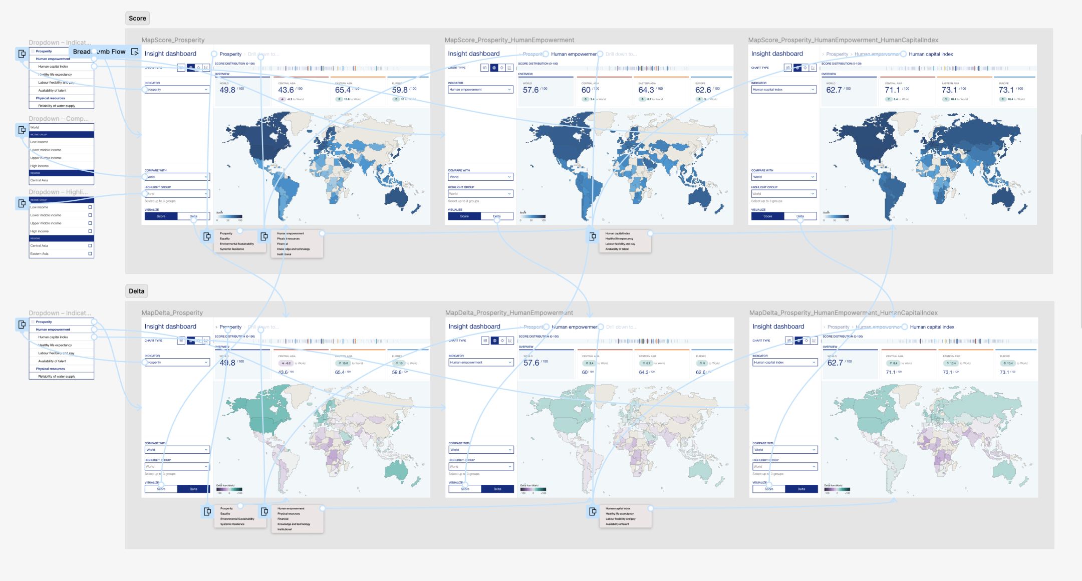
Image: Figma prototype I did to ensure the the design was intuitive (happy path!).
wireframe
Let's keep things flexible
The first step was—of course—looking for similar structure patterns in WEF leading products’ data. As it turned out, the Forum frameworks’ usually consist of a selection for indicators that are thematically grouped in multiple levels of aggregates.
So, as we explored different dashboard layouts, our approach was anchored in accommodating these nested hierarchical data structures while ensuring a high level of flexibility in the long run.
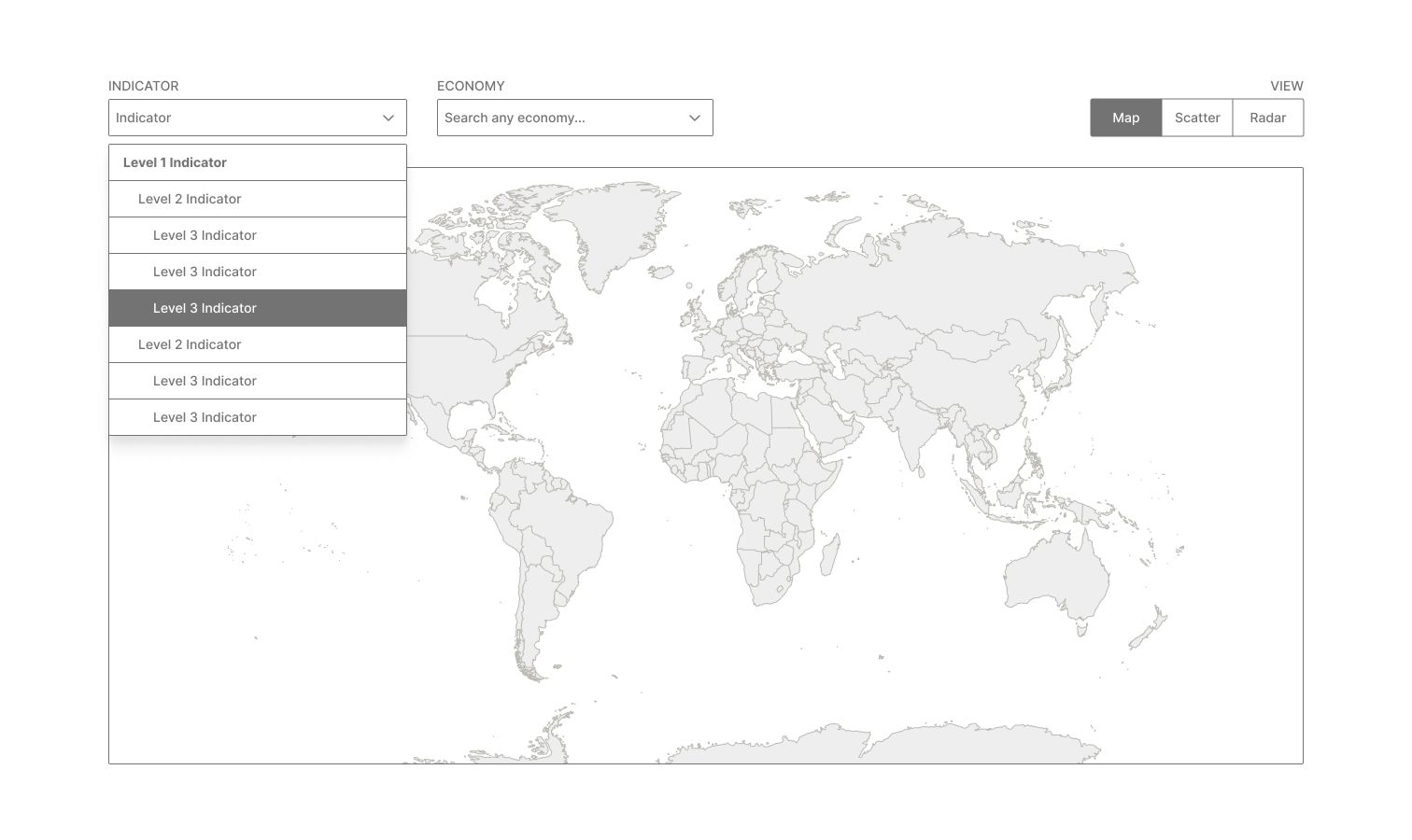
Image: Layout 1
Layout 1 displays filters above a world map, just like the Accurat team did when designing the Global Gender Gap data explorer back in 2017 (see here). The layout is fairly simple, uncluttered and has a low cognitive load, but the data structure is completely hidden behind a dropdown, and there are no summary statistics nor filters to help users quickly get insights from the data.
Building from there, in Layout 2 we explored an opened list of indicators on a side panel, but eventually felt there were better ways to organize the elements.
We eventually found a good spot between clarity and power with the third exploration, where we moved filters and controls within a side panel, hid the Indicator list within a dropdown select and introduced a breadcrumb component above the map to give context on the depth of the data structure. In this way, we covered two use cases at the same time: while the breadcrumb interaction required a step-by-step navigation through levels to get familiar with the data structure, the dropdown menu provided immediate access to any indicator in the list. This was indeed beneficial for users who know exactly what they are looking for or prefer to bypass the hierarchical drill-down. Finally, we were thinking about introducing a carousel of KPI cards above the map, to provide some quicker regional insights.
Even if both the radar and the economy views weren't in scope for the first iteration, it was important for us to sketch them to have a high level idea on how those views would work in the future. As always, we involved our development team early in the wireframing process, to ensure that everything was feasible within the existing timeline and align our expectations for the delivery.
Images: Other wireframes for Layout 3.
First iteration
Designing for depth and discoverability
The following step was defining the overall UI in detail, and testing the design with selected users before sharing it with the Forum’s team. And yes, this also meant building some little prototypes with real data in Figma!
While designing the interface, we introduced a couple of additional details:
- A dispersion plot above the cards to let users quickly understand how scores were distributed across the spectrum and eventually identify patterns within the data.
- A “Drill down to…” call to action after each aggregation level to encourage a deeper exploration of the data.
Image: Figma prototype I did to ensure the the design was intuitive (happy path!).
Our overall approach proved successful during usability testing, as the breadcrumb was giving a precise visual cue of the actual depth while navigating different levels of granularity. We also worked on other components such as, the "Compare with", "Highlight group" and the two visually distinct map palettes (Score and Delta) demonstrated to be very useful towards making the overall experience engaging, insightful and customized.
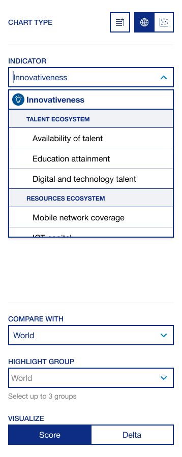
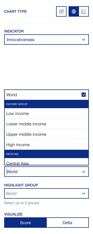
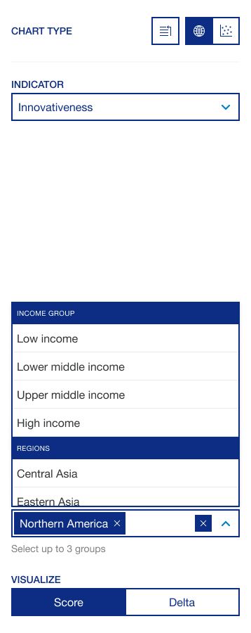
Image: Side panel design, final version (map view).
Video: "Visualize" segmented control interaction (Future of Growth 2024 dashboard).
When designing and implementing the scatter plot view, we prioritized three key things:
- The chart aspect ratio needed to be fixed at 1:1 to guarantee equal proportions between the x and y axes at any breakpoint. This was done to avoid misleading perceptions when decoding the data.
- Dots needed to transition to their new position when a different indicator was selected.
- We needed to be consistent with the controls set up in order to reduce the learning curve when using different parts of the tool. Also, components "Compare with" and "Highlight group" needed to share their state between the two visual models.
Video: Scatter view interactions (Future of Growth 2024 dashboard).
Even though we kept the same structure, on the scatter plot side panel we added some additional controls tailored to this specific type of chart:
- A second indicator selector—as the visual model required two indicators to be selected, one for each axis (X and Y).
- A "Color" segmented control to color code the dots by either region or income, allowing for multifaceted analysis within the same view.
- A "Search" dropdown to allow users to quickly find and focus on a specific economy without the need to look for it within the chart.
Video: First launched version of the dashboard, full flow (Future of Growth 2024 dashboard).
Takeaway
Keep looking forward!
Looking back at the evolution of the collaboration with the World Economic Forum, I am super proud of what we have achieved together so far and I'm super excited about future milestones and projects together!
Credits
Team Leader
Pietro Guinea Montalvo
Design
Davide Bruno
Jacopo Poletto
Development
Vito Latrofa
Benedetta Menaggia
Verdiana Pasqualini